
Album Art

I combined 3D geometric shapes with a photo collage to create a layered, retro look. The fragmented structures frame the central face, blending human and architectural elements to hint at themes of identity. The textured finish adds a worn, tactile feel, balancing the sharp digital forms with something more organic.

For this concept, I used 3D software to build the scene. The sofa, lamp, and table are modelled objects, while the dune landscape is fully procedural and made with the node editor. I wanted to create a small, familiar space that feels untouched by the “vast sands of time,” reflecting the vocalist’s feelings of unreturned love. I also shortened the focal length when rendering to give the scene a more secluded, inward-looking atmosphere.

Initially hand sketched and then scanned and digitally coloured completed. Reflecting the themes of the music with a comic book style.

Inspired by the style of Luke Hunter an Australian painter, created to begin with on paper, then scanned and finished digitally. It captures love's last stand at the end of everything.
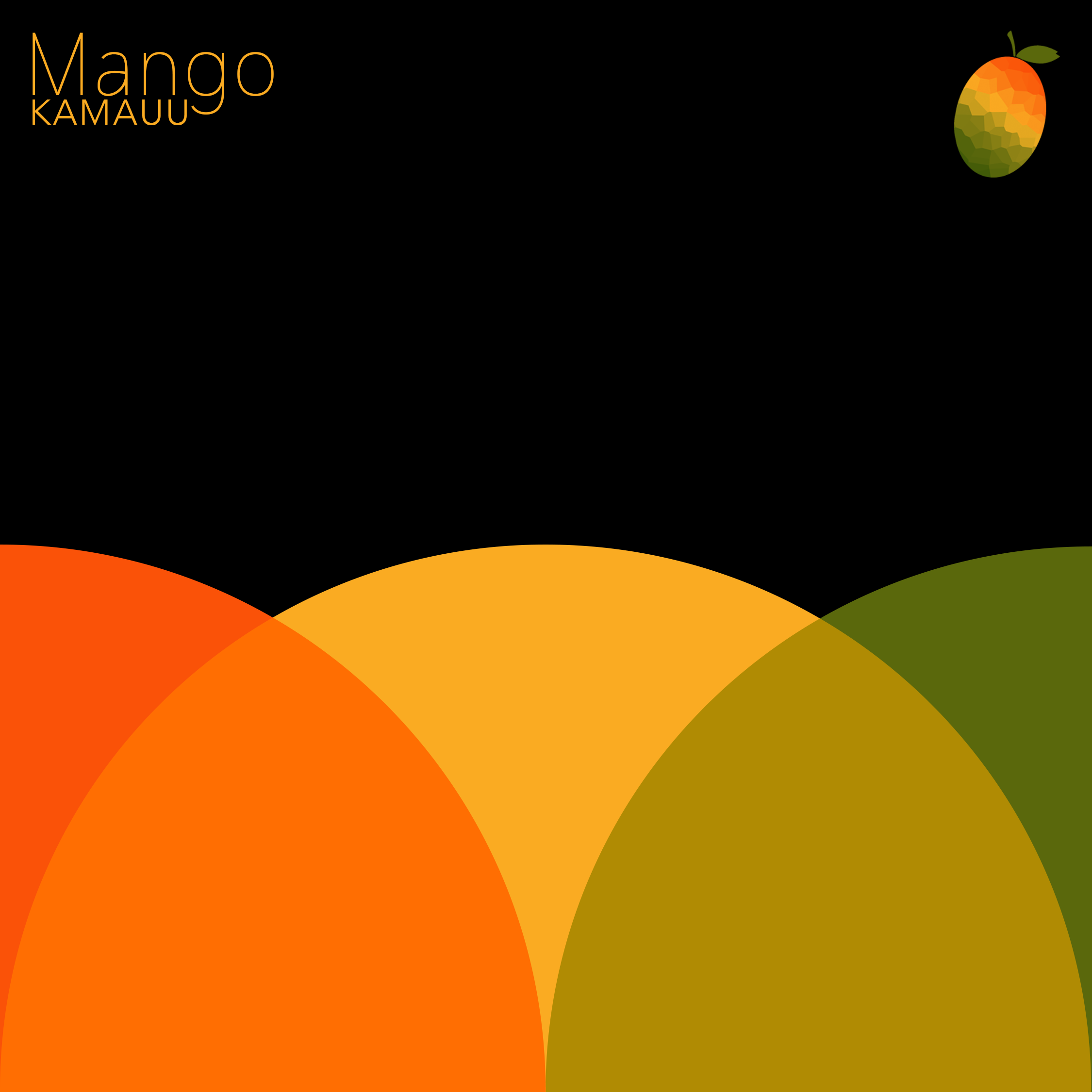
I went for a simple, playful look with warm mango tones and overlapping shapes that feel as bright and layered as the track itself. The little low poly mango in the corner adds texture without taking away from the clean layout, letting the colours carry the vibe.

This one leans into a heavy, gritty feel to match the music’s raw energy. The black-and-white skull, bold orange type, and chunky chain give it a vintage rock attitude while still feeling sharp and alive.

I combined 3D geometric shapes with a photo collage to create a layered, retro look. The fragmented structures frame the central face, blending human and architectural elements to hint at themes of identity. The textured finish adds a worn, tactile feel, balancing the sharp digital forms with something more organic.
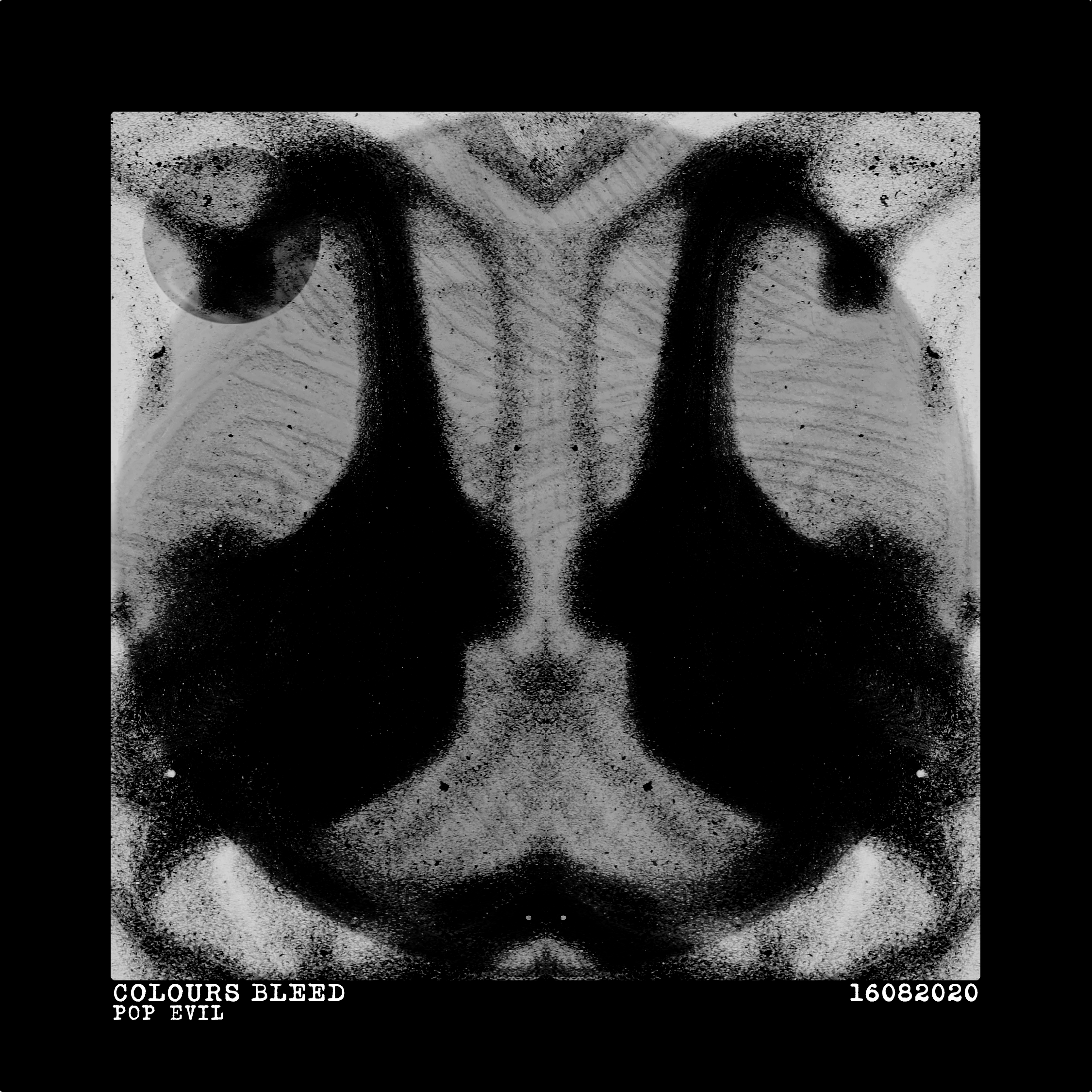
Created by photographing swirling latte foam, editing and mirroring the images to resemble old Rorschach tests.
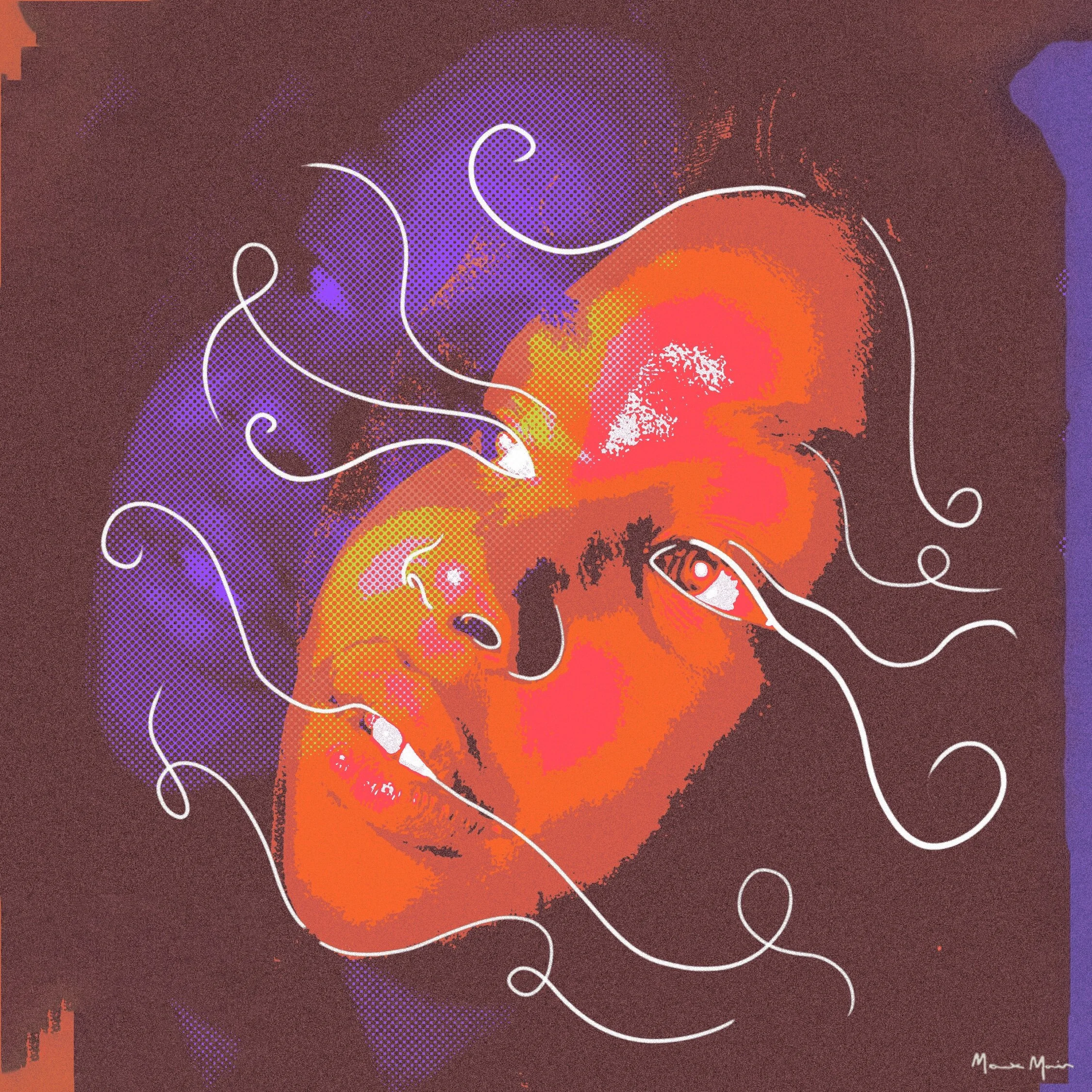
Photograph drawn on by hand using white brush tip pen, then scanned and digitally altered, layered multiple times and recoloured, leaving some artefacts as part of the final image.

Created digitally, an endless loop design inspired by celtic knot designs. Using retro colours and textures that reflect the synth heavy sound of the music.
Time Moves Slow EP Art
Project Purpose: Created as an album cover inspired by the track "Time Moves Slow".
3D Software: Entire scene modeled and rendered in Blender.
Procedural Environment: Sand dunes generated procedurally using shader nodes and displacement mapping.
Asset Modeling: Sofa, lamp, and table were modeled from scratch to create a surreal desert composition.
Visual Style: Used shallow depth of field to evoke a miniature / macro aesthetic.
Post-Processing: Final touches, color correction, and typography added in Adobe Photoshop.
Theme & Mood: Emphasises isolation and slow passage of time using soft lighting and vast negative space.
Loungewear Design, Production and Photography




-
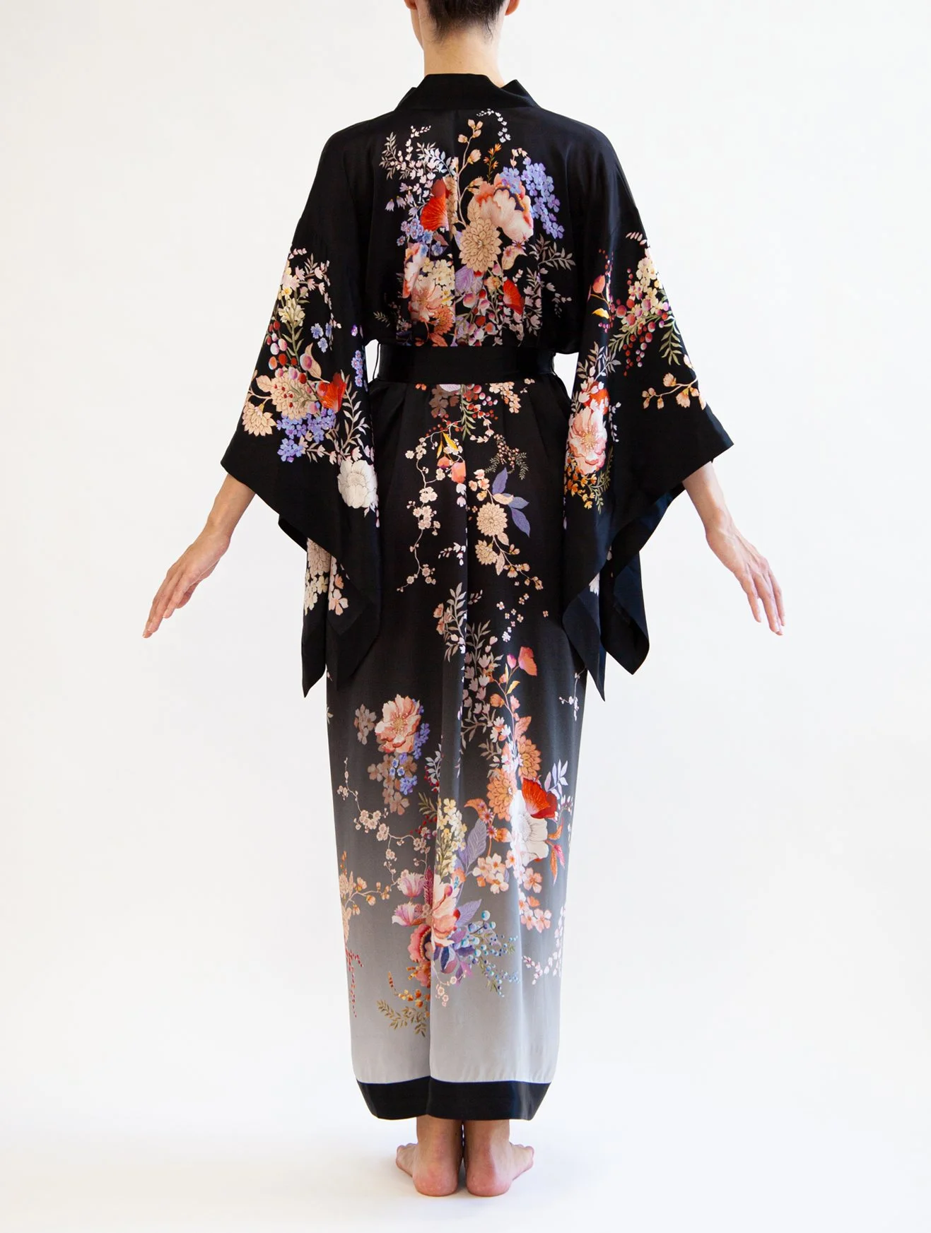
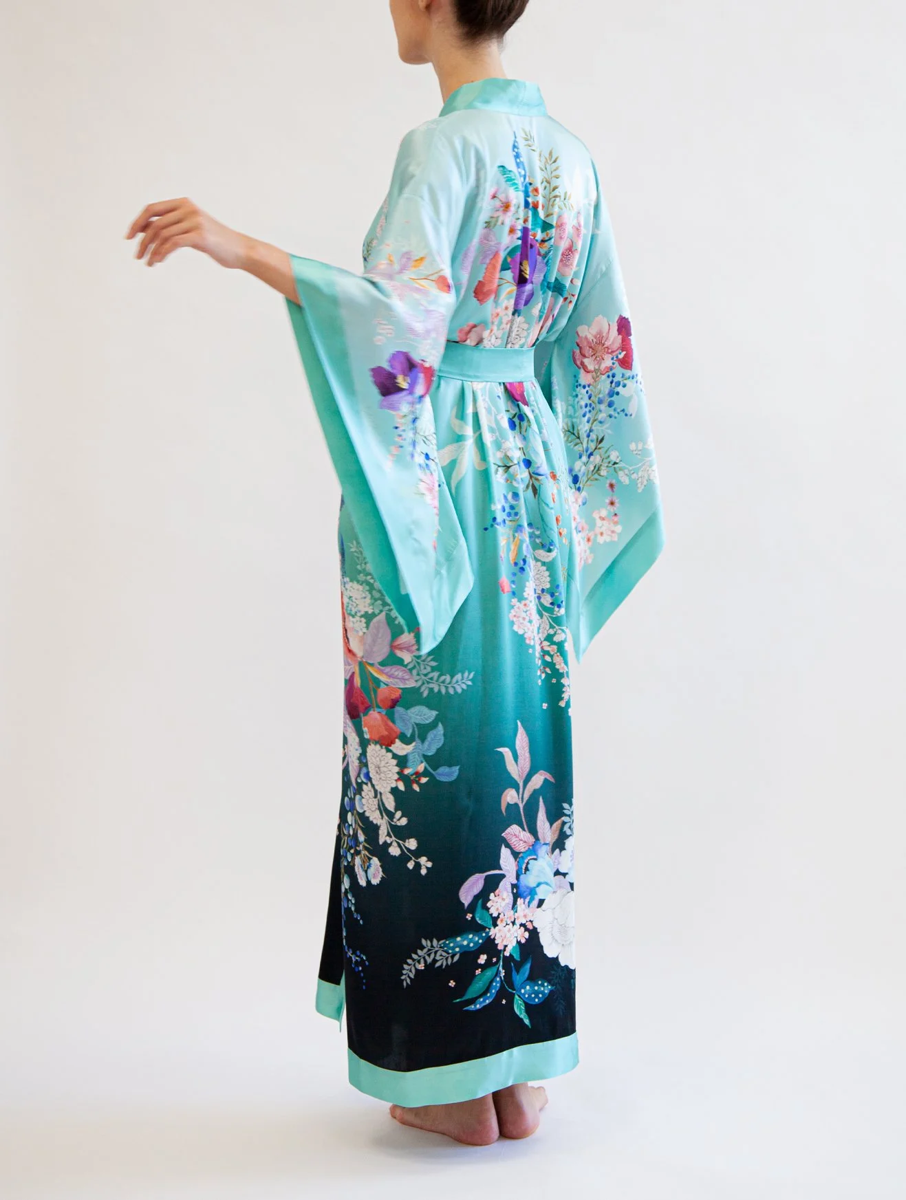
Colour Inspiration: I drew inspiration from the traditional Eastern silk dyeing techniques, using an ombre effect that blends the old with the new, giving it a modern twist.
Merging the Traditional and Modern: The design fuses classic craftsmanship with contemporary aesthetics, creating something that feels timeless but still fresh.
Collaboration with Freelancers: I teamed up with freelance artists to create custom elements—think floral patterns and unique textures. Then, I took those designs and digitally recoloured them to match the overall vibe.
Print Creation: After finalizing the individual elements, I brought them together to form a cohesive print design that reflects the whole collection’s vibe.
Choosing Materials: I selected fabrics that were both luxurious and comfortable, ensuring they looked great and felt good to wear.
-
Managing Production in London: I was hands on throughout the whole production process, from start to finish, making sure everything stayed on track.
Fabric & Sampling: I spent time sourcing high-quality silk for us to print on and worked closely with the fabric printers in sampling to ensure we got the perfect colour balance and definition.
Manufacturing: I was involved in overseeing the manufacturing process, making sure everything was stitched together with precision and that the final product matched the original vision.
Quality Control: I made sure everything passed through quality checks to guarantee the pieces were free from defects and lived up to the standard we aimed for.
Sustainability: Where possible, I made an effort to keep the production process sustainable, using eco-friendly packaging and minimising waste during production.
-
Model Selection: We found the perfect model who really embodied the style and vibe we were going for with the collection, capturing its relaxed yet elegant nature.
Set & Lighting: I set up a clean, minimalist environment for the shoot, using soft lighting to enhance the relaxed yet luxurious feel of the pieces.
Directing the Shoot: I directed the shoot to focus on the natural flow of the garments, making sure to capture the ombre design in the best possible light.
Candid Shots: I wanted the photos to feel authentic, so I aimed for more candid, natural moments that really represented the lifestyle of the loungewear.
Post-Production: After the shoot, I handled all the editing and retouching, ensuring the images came together perfectly and captured the soft, dreamy aesthetic of the collection.
Logo Redesign
Inspiration
Initial Inspiration: I drew inspiration from traditional Chinese window screens and Chinese seals, both of which are rich in cultural symbolism and craftsmanship.
Cultural & Brand Alignment: These elements felt like the perfect starting point to reflect Meng’s heritage while bringing a modern twist to the brand’s visual identity.
Logo Shape & Structure: The window screen influence inspired a grid-like structure in the design, symbolizing strength and balance. The seal influenced the overall stamp-like feel, giving the logo a sense of authenticity and tradition.
Concept Development
Symbolism: The grid structure of the window screen represents the idea of organisation and clarity, which aligns with Meng’s core values of precision and quality.
Colour Palette: I used a limited colour palette that reflected traditional Chinese colours, with a focus on deep reds and blacks, symbolising power, elegance, and timelessness. And continuig with colours already in the brands palette.
Iterations & Testing: I explored several iterations, refining the design in multiple formats to ensure it would work across both digital and print mediums.
Feedback & Refinement: After gathering feedback from the team, I made final adjustments to ensure the logo would be both memorable and adaptable for various brand applications.
Poster Art





Arlo Parks Merch Proposal
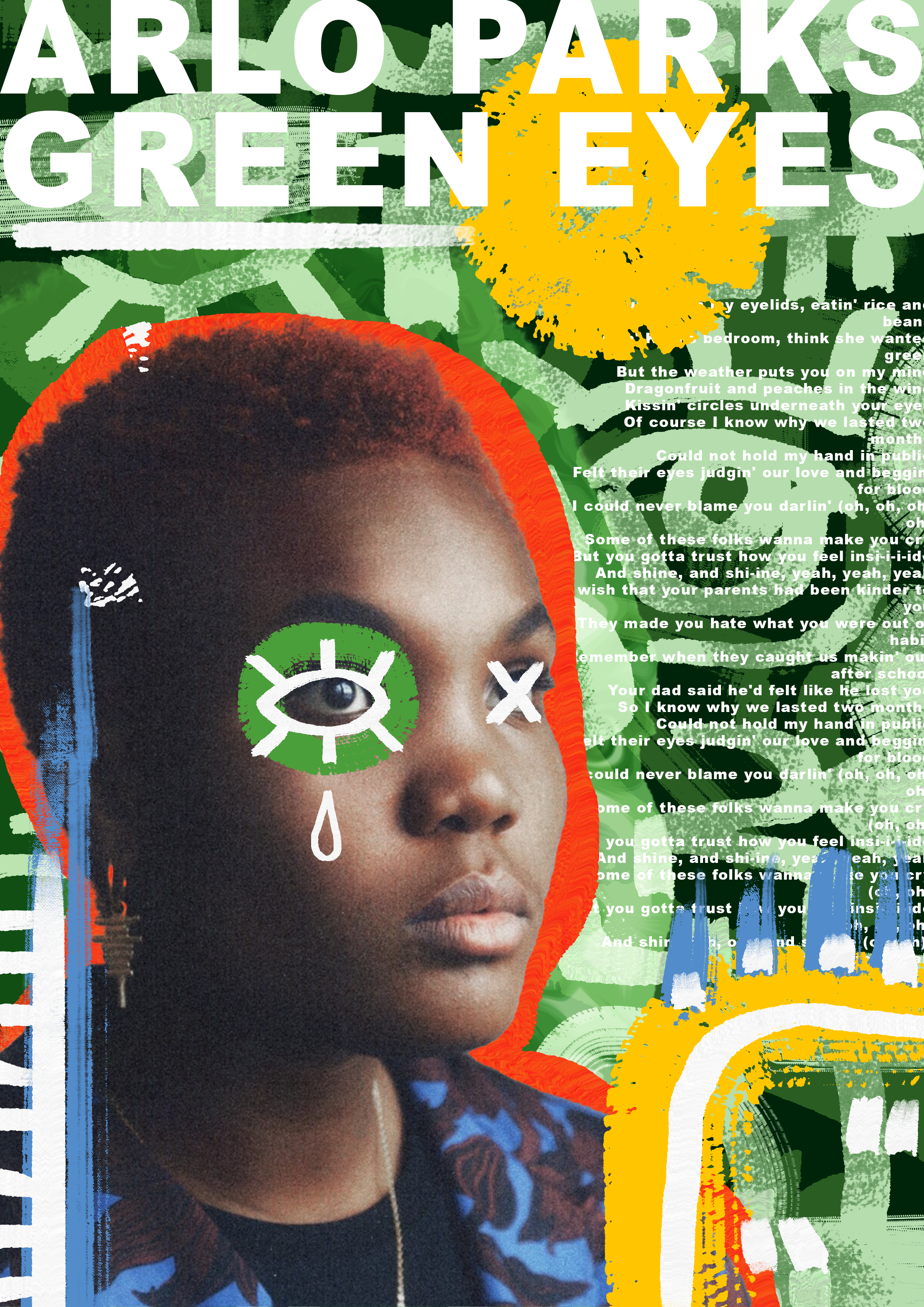
Concept Development: Created a concept that aligns with Arlo Parks’ unique aesthetic, focusing on soft, artistic, and personal elements.
Design Inspiration: Took inspiration from album artwork, lyrics, and Arlo's personal style to create pieces that resonate with her fanbase.
Product Selection: Proposed a variety of items including t-shirts, hoodies, posters, and accessories, ensuring a mix of wearable and collectible merchandise.
Graphics & Typography: Developed custom graphics and typography based on themes from Arlo’s music, aiming for an intimate, understated feel.
Ocado Valentines Graphics


Developed a spicy, playful visual identity for a fictional hot sauce brand called Cactus Tears, emphasising heat, flavour, and Southwest desert inspiration.
Created multiple bold and vibrant colour palettes using shades of red, green, orange, and yellow to evoke spice, freshness, and energy. Included earthy tones to balance the palette and convey a natural, grounded feel.
Explored a variety of logo concepts incorporating cactus motifs, teardrop shapes, chili peppers, and flame imagery to reinforce the brand name and product heat.
Used hand drawn and playful typefaces that complement the organic and spicy nature of the product, ensuring the brand feels approachable and distinctive.
Designed realistic 3D bottle mockups showcasing the final logo and label design in context. Labels include stylised cactus illustrations and layered textures for visual depth.
Chose a teardrop shaped flame logo featuring playful typography that reinforces the brand’s bold yet fun tone. This version was applied across the bottle labels and marketing materials.
Maintained cohesive design elements - colours, iconography, and type - throughout logos, packaging, and presentation layouts to create a strong, memorable brand identity.
Designed to appeal to adventurous food lovers and spice enthusiasts, with packaging and visuals that stand out on the shelf and suggest high heat with personality.
3D Diorama


3D Software: Created the entire graveyard diorama in Maya, modeling each element from scratch.
Modeling: Modeled gravestones, trees, fences, and surrounding elements to build a detailed, atmospheric scene.
Texturing: Applied custom textures to give the models a realistic, weathered look, enhancing the eerie, aged feel of the graveyard.
Lighting & Composition: Focused on lighting to create a moody atmosphere, with shadows and highlights that contribute to the overall dark, haunting vibe of the scene.


